Switch Between List
and Card Views
List view for density, card view for visual scanning - use what fits your workflow
UNDERSTANDING THE VIEWS
List View vs Card View: Different Information Density
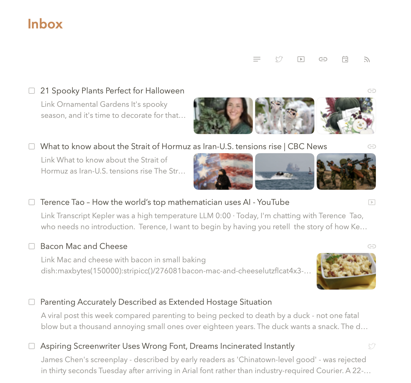
Pachinko offers two ways to view your tasks: list view and card view. List view shows tasks as compact rows with titles and key metadata - dates, statuses, project names. It's information-dense, letting you scan many tasks quickly in limited screen space. Card view shows tasks as larger cards displaying images, and a preview of your first few lines of text. It's better for visual scanning when you want to see more context at a glance without opening each task.
Neither view is better - they serve different purposes. List view works well when you know what you're looking for and want to see many options quickly. Card view works well when tasks have visual elements (images, longer descriptions) or when you're browsing rather than searching. Switch between them based on what you're doing at the moment. We built both views because Gary and I couldn't agree on which one was "correct." Turns out we were both right, which neither of us will admit to the other.
CHOOSING YOUR VIEW
View preference often depends on the type of tasks you're looking at. Text-heavy tasks with no images work fine in list view. Tasks with attached photos, or longer descriptions, benefit from card view's extra visual space. Many people switch views throughout the day based on context rather than picking one permanently. I switch based on mood. Gary switches "based on information density requirements." Same behavior, different rationalizations.